
Background and Problem
D2L Incorporated was developing an online learning platform for small to medium business. This platform was internally named Cabinet. Cabinet was meant for compliance training for corporate customers. Based on user research and competitive analysis it was decided that a mobile solution was needed. Corporate users are busy and prefer to complete their compliance training as quickly as possible. However, at the time Cabinet was only available as a desktop solution.
The goal of this project was to make it easy for users to complete their training on the go.
Role and Ownership
I was working as a Product Analyst intern at D2L Incorporated. Based on my own initiative I was given full ownership of the project to create a mobile version of Cabinet. I was in charge of conducting a technical analysis to choose what mobile technologies to use for a creation of a mobile solution. I created all the wireframes, user flows and mockups of the design. I also wrote and conducted usability tests and provided comprehensive summaries of the results. In my role I was responsible for competitive analysis which I also applied to this project. I received feedback on my designs from the design team at D2L as well as the product owner of Cabinet.
Tools
- Paper, markers, and sticky notes for ideation
- Keynote for quick wireframes
- Sketch for mockups
- Google Survey for keeping track of user testing results.
Process
Personas
Stacey - Learner
- professional working at a medium to small business
- Has a smart phone and is tech savvy
- Very busy and is always on the go
- Needs to do compliance courses but wants to get them done as quickly and painlessly as possible so she can get back to work
Andy - Administrator
- Professional working in Human Resources or in a Management position
- In charge of assigning compliance courses and making sure that all employees have completed mandatory training.
- Need to easily see the progress of their subordinates as a whole as well as individually.
- Need an easy way to set up and manage compliance courses
It was decided that the designs would focus on the learner’s perspective and not the admin perspective. Competitive intelligence and user research showed that administrators were less likely to create, and manage content on mobile devices. In an effort to streamline the user interface, all administrative functionality was not included in the mobile designs.
Solution Requirements
Requirements were gathered based on existing user interview results and user personas. Competitive analysis was also conducted by researching competitors’ and the features of their mobile solutions as well as user reviews of those solutions. The research was then combined and distilled to the following six requirements.
- Must be a streamlined experience so that the user can complete training quickly and efficiently.
- User should be able to access the most common tasks from the home page.
- Required courses must be accessible within a minimum number of clicks upon entering the application.
- User must be able to access and complete all course content on their mobile device.
- The application should seem consistent with the desktop version of Cabinet.
Solution
Several iterations of design were conducted based on feedback from coworkers as well as design critiques held by the design team. The following solution was chosen to be tested. The design focuses on removing any functionality that is unnecessary on mobile and really streamlining the course experience to help users get in and finish their courses as quickly as possible.
Global Search
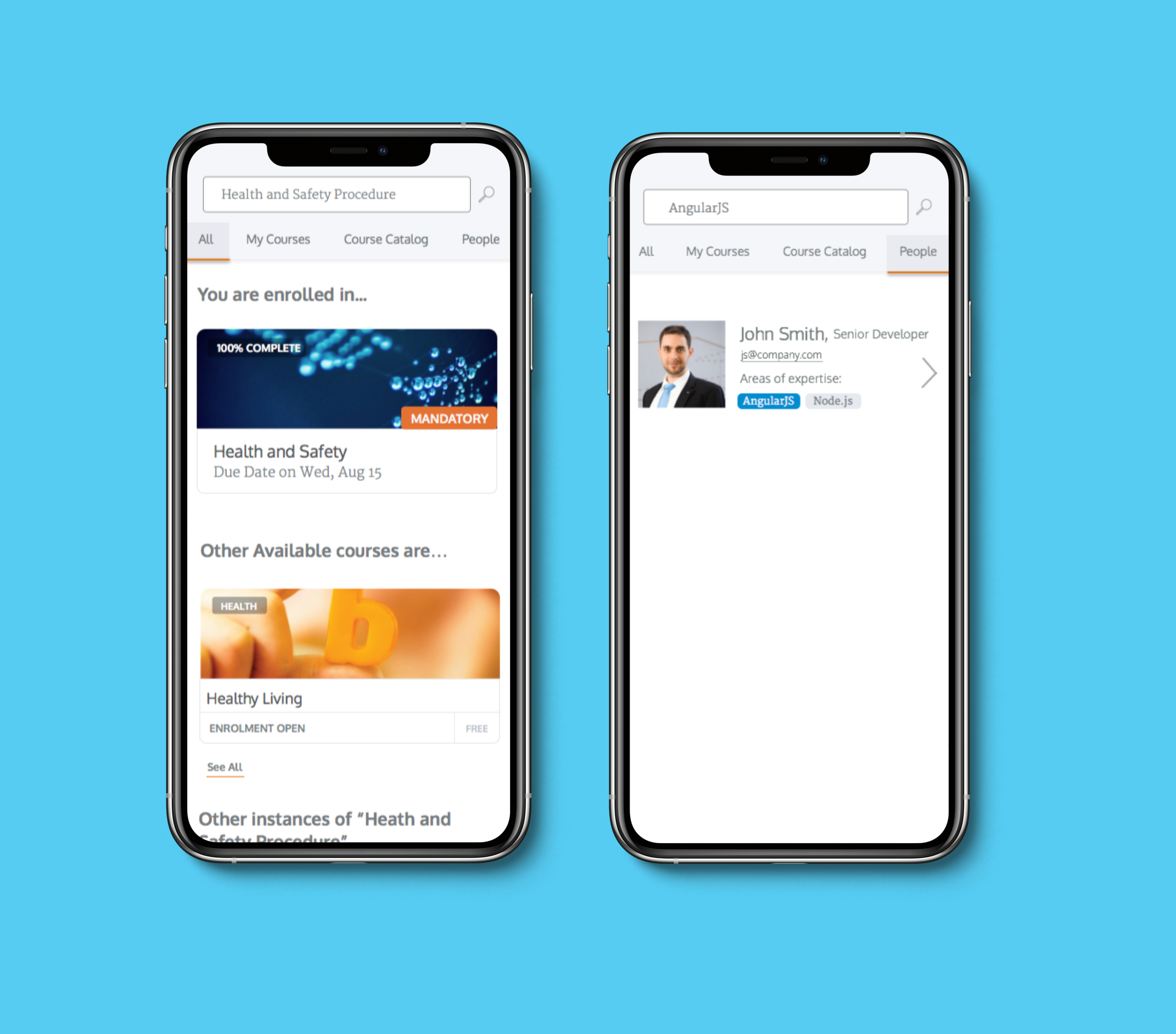
Easily find and browse courses.
Search for coworkers based on team or skills.
An immersive experience which removes outside navigation to reduce clutter and allow for added filtering.
Easily complete mandatory courses
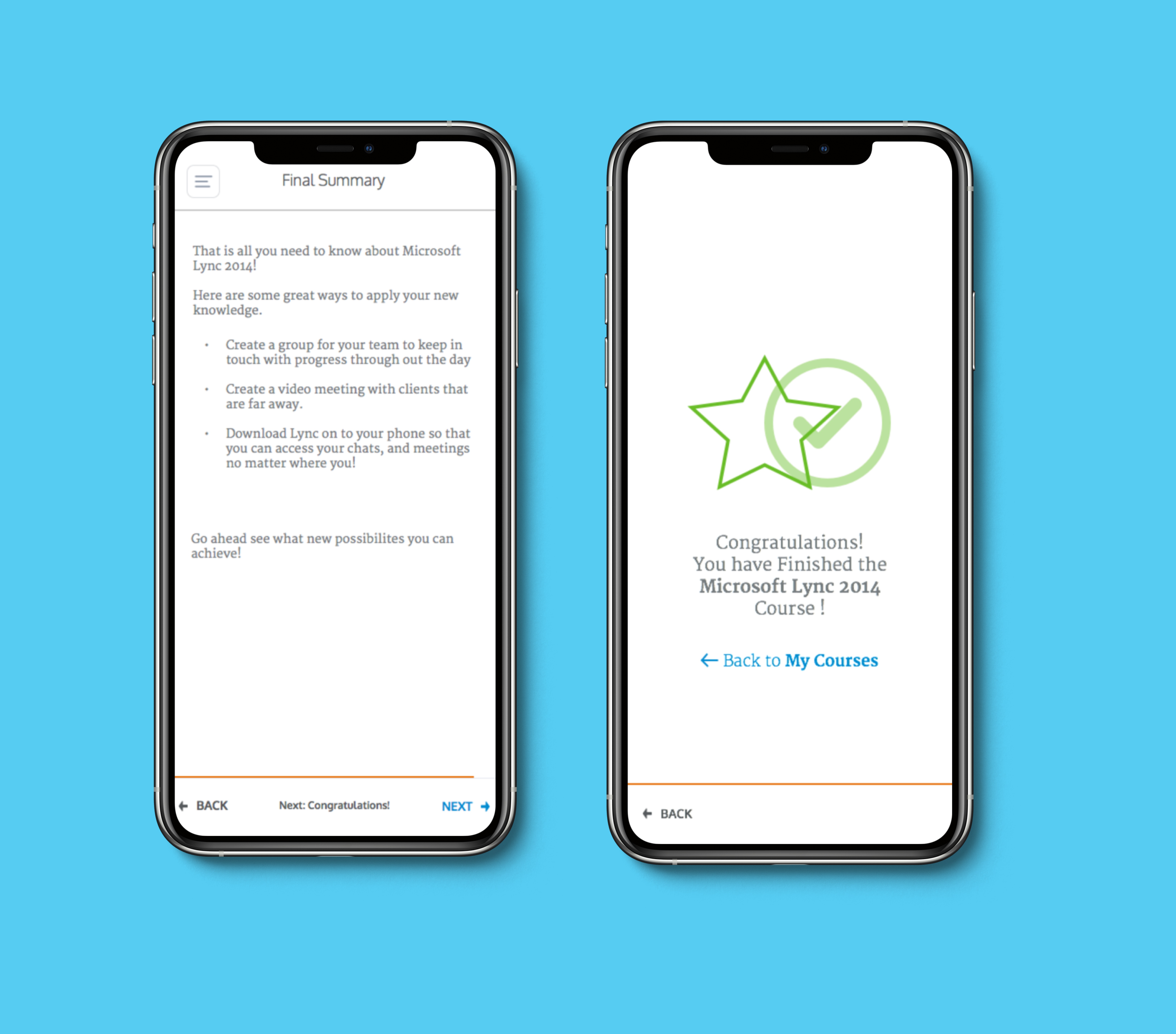
The design allowed the user to fully immerse themselves in the course content without distractions
Design provided rewards for finishing a course
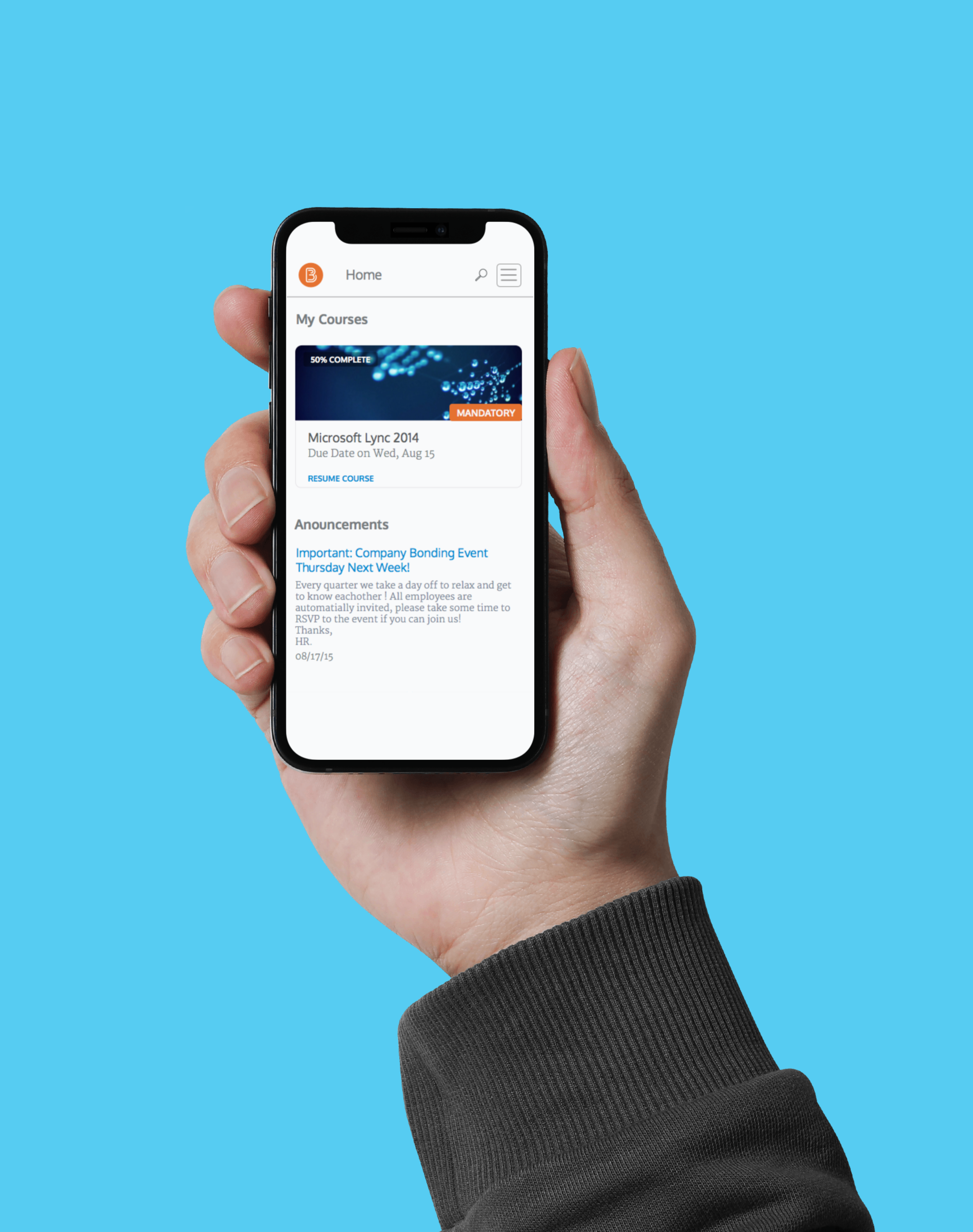
Easily navigate to and see important information
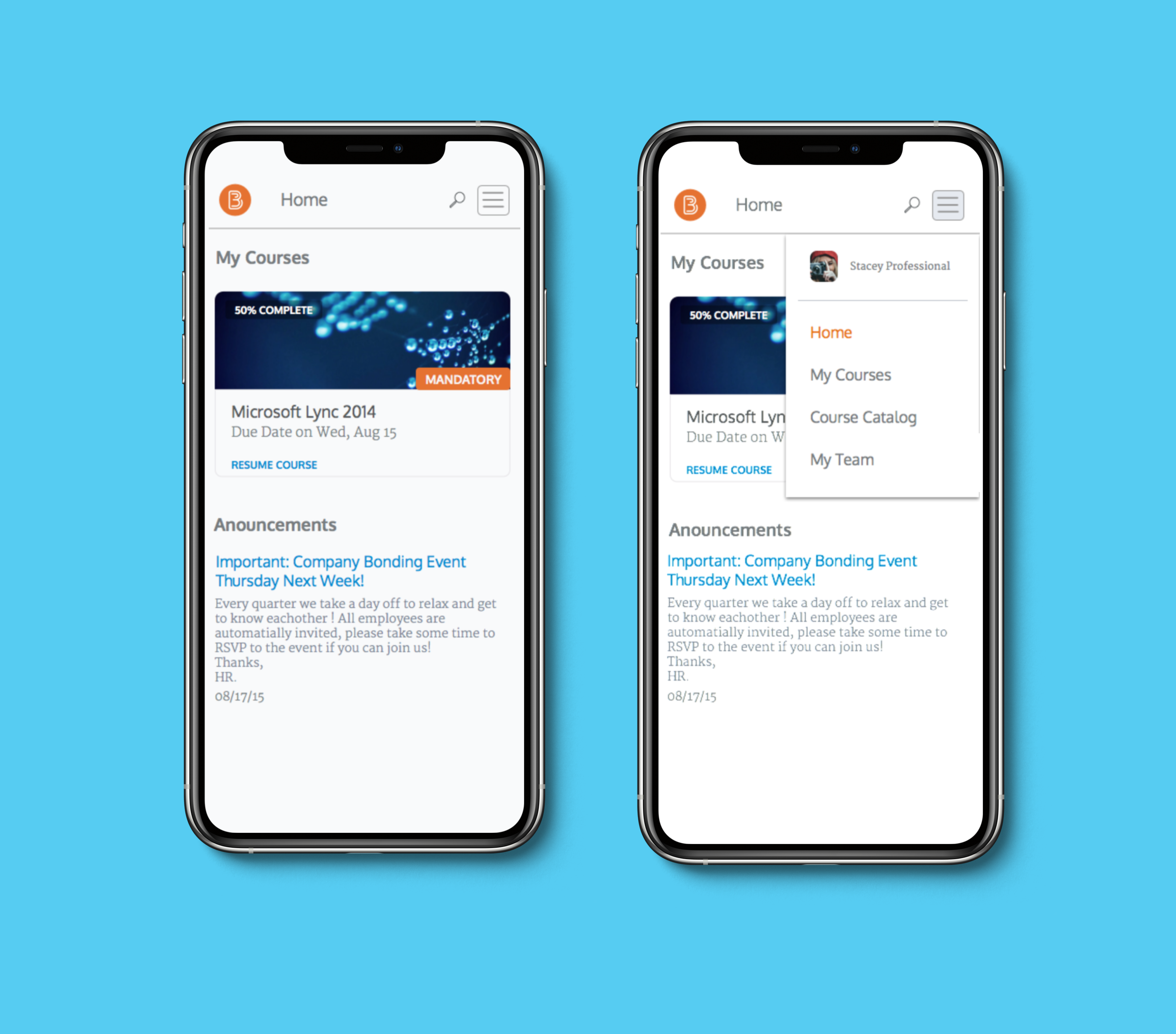
Home page assembles current courses as well as company announcements
Intuitive navigation allows users to find information that is relevant to them
Testing and Validation
The final design, was tested with five users selected from D2L employees that were not associated with the Cabinet project. A prototype was made using Marvel and can be seen here.
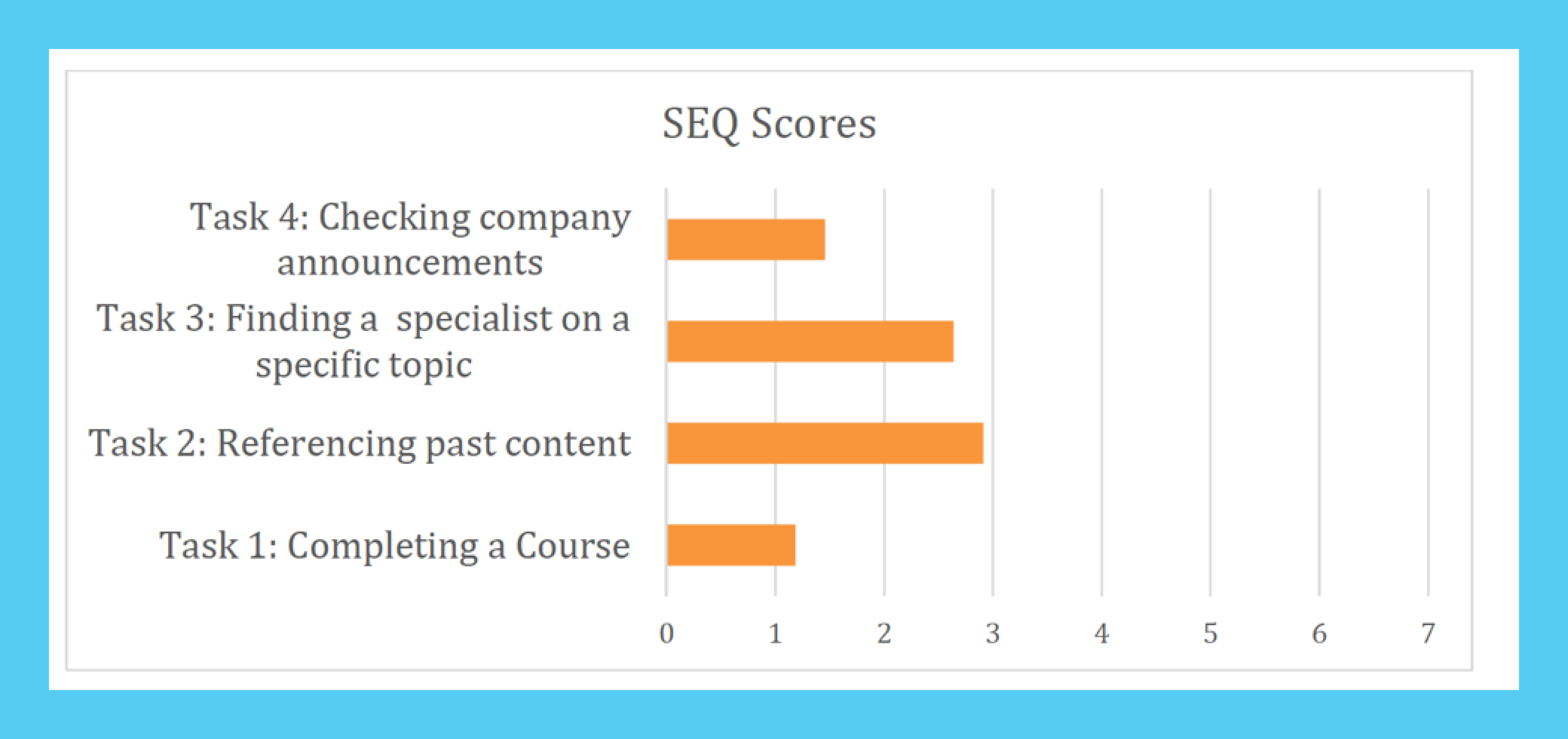
Participants were asked to perform four tasks.
- Completing a Course
- Referencing past content
- Finding a specialist on a specific topic
- Checking company announcements
Single Ease Question (SEQ) is a seven-point rating scale used to assess how difficult users found a task. The lower the SEQ score, the easier the task was to complete. The participants’ responses were averaged for each task to gain insight about the difficulty of the task.
Overall Usability was measured using the System Usability Scale (SUS). This system is used to judge the overall usability of a system. SUS gives a score from 0 to 100 but doesn’t represent a percentage. For example, an average system has a score of 68. The mobile version of Cabinet scored approximately 76, meaning the design created an above average experience.
Next Steps
The user testing revealed several pain points in the design which will need to be improved;
- Include bigger touch points in future prototypes
- Reduce confusion between local and global navigation within a course on the congratulations page
- Search capabilities are unclear on the My Team page. ie. Users didn’t understand that they could search by skill.
- Make search icon more salient.
Once these design improvements are made, the user testing should be completed again to ensure that the issues are fixed. Future design iterations should also include test participants from outside the D2L corporation in order to avoid bias.