
Background and Problem
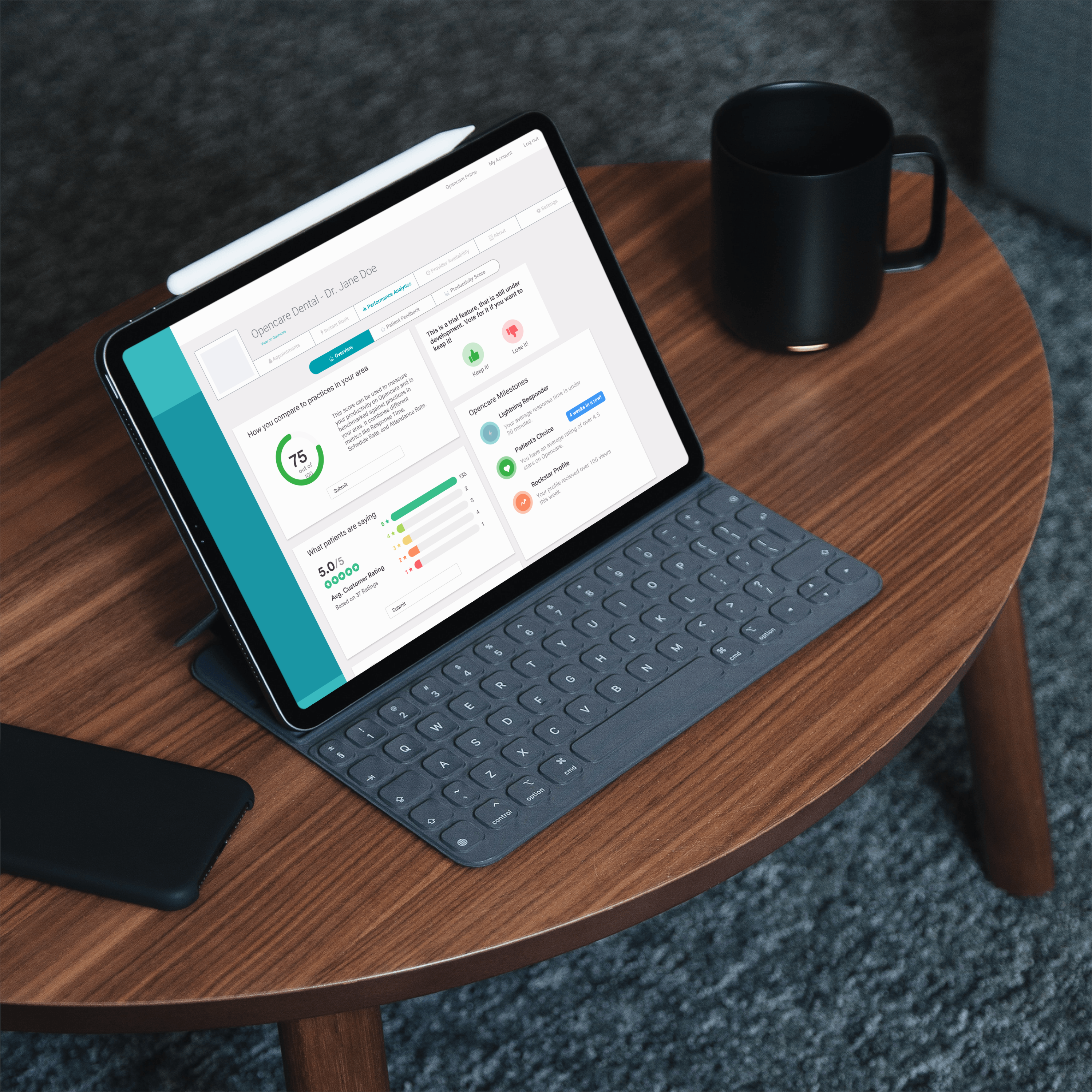
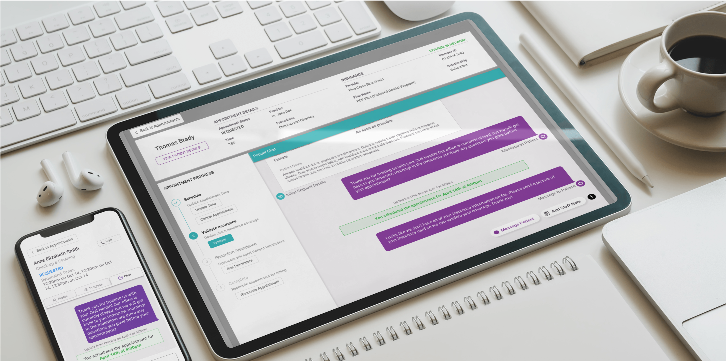
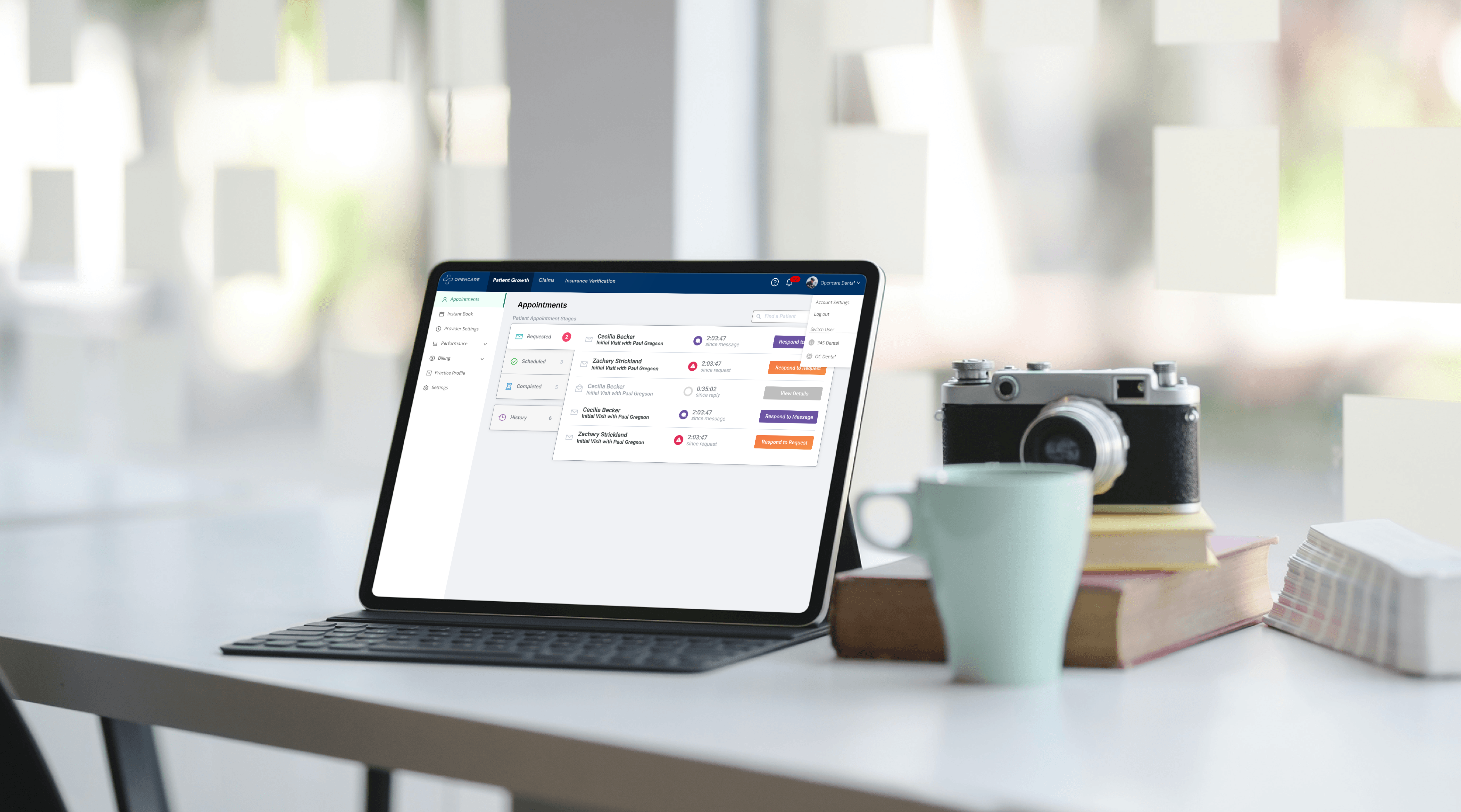
Opencare is an online platform that helps dental practices acquire new patients. Patients are asked a series of questions to match them with the perfect dentist for them. Once patients choose a dentist they submit an appointment request to practices. An office manager at a practice must process this request, ensure that they have the necessary patient information and confirm an appointment time. Opencare provides an app for office managers to message patients.
The current app was designed 7 years ago with different users in mind. Opencare used to be a platform for patients to find all forms of preventative care and then later specialized to just dentistry. The old information architecture was also optimized for SEO(Search Engine Optimization) ranking since that was the business model at the time. Now the Opencare product is geared towards dentistry and has a suite of tools that are attached to practice accounts.
The main goal of this project was to create a new information architecture that fixes issues with the current app but also creates space for future features and cross sell opportunities.
Role and Ownership
As the sole designer on the project I was in charge of user research, prototyping, usability testing and follow-up design iterations. Received feedback from other members of the product team, as well as the executive leadership team.
Tools
- Figma
- Tree Task Testing
- Dovetail
Project Requirements
Biggest Issues with the current information architecture:
- Unclear hierarchy - The current app has navigation in three different places which creates confusion for first time users.
- So many tabs - There are many tabs which are overwhelming for the user. It also means that there is not a lot of space to add new features or cross sell new apps.
The main goals of new information architecture are:
- Make it easier and more intuitive so that practices can spend less time looking for things and more time with their patients.
- Make it dentistry specific. Try to follow existing mental models in dentistry when organizing information.
- Future proof - the company was moving towards a platform approach where each practice could opt-in to a variety of tools. The new information architecture would have to support cross-selling future Opencare products.
Process
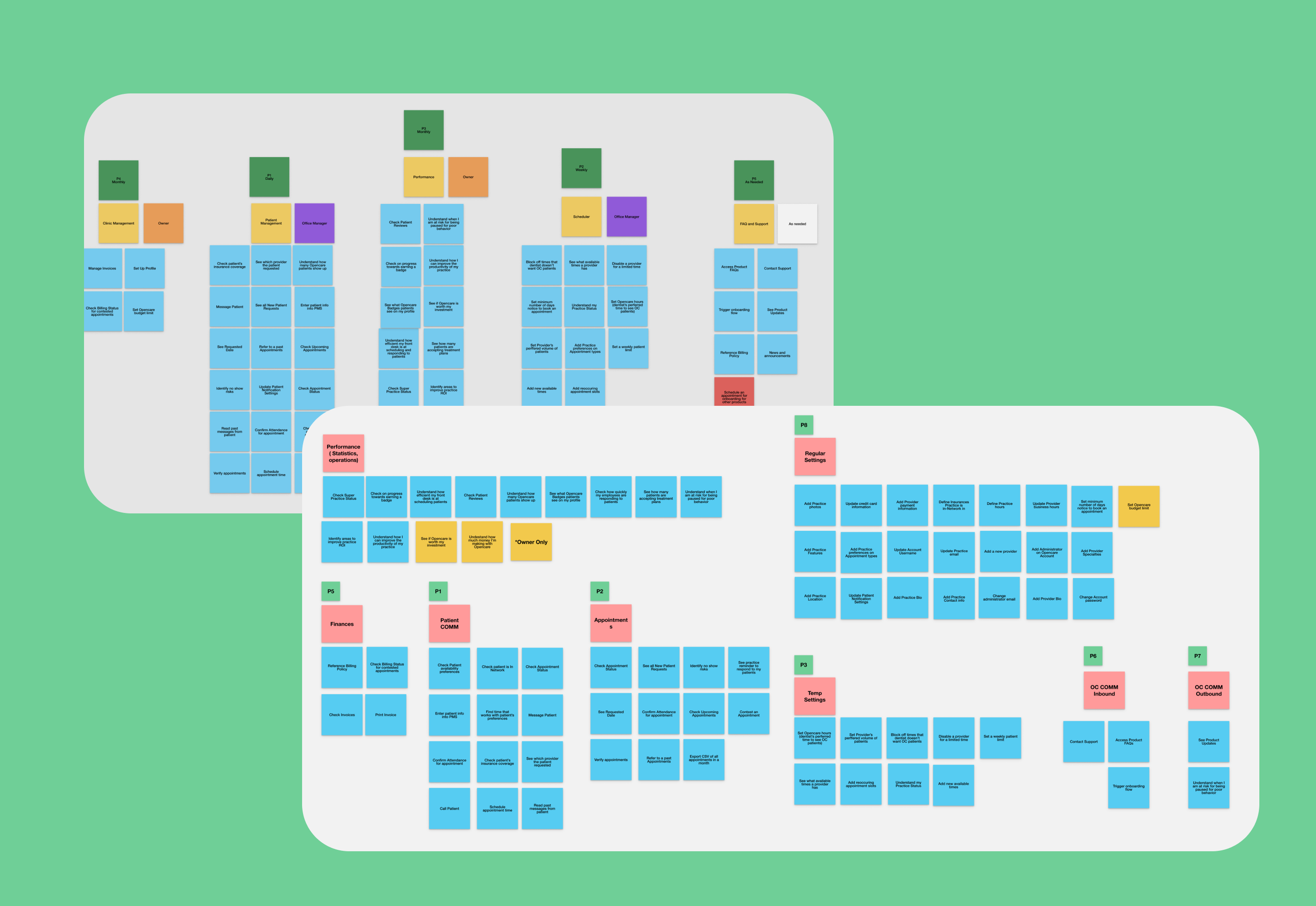
Card Sorting
Card sorting is a design technique used to see how users group information. Participants are given a set of cards (in this case these were sticky notes in figma), and asked to organize them to groups. Participants are then asked to label the groups and add any missing information to them. I ran card sorting exercises with internal teams as well as current Opencare customers to see how they would organize the existing information. I also included some cards with future features from new tools to see where people would put them. This process was invaluable since it was evident that there were some recurring themes and clear groupings for the future.
Competitive Analysis and Research
I conducted a lot of research into common information architecture patterns and best practices so that I could make educated decisions on how to move forward. I also looked at how other companies organized their information. I looked at dentistry applications such as Dentrix, Eagsoft, Zocdoc, Zentist and Dental Intel. I also looked outside of dentistry to see how other platform based products organized their information.
Key Takeaways:
- Many platforms try to keep their sub navigation patterns within the apps consistent
- Older dental systems like tab navigation to show all options at once (high discoverability but also very overwhelming)
- Dental platforms tend to be more visual and rely heavily on mental models ( ie. the Dentrix interface is a literal depiction of a dental office)
Decide On Overall Hierarchy
After doing many iterations of different tree diagrams, I zeroed into two main options. Task Based or App Based.
Task Based
- The task based option sorted the information based on the type of tasks the user could need to perform. All setup and configuration actions would be together, and sorted by app, and etc.
- This is a common UI pattern for dental product management systems, and is also the most intuitive for the short term while Opencare doesn’t have many apps.
- This option quickly gets messy once you add more apps,and could result in an overwhelming amount of options in each section.
App Based
- The app based approach is more similar to other platforms outside of dentistry such as Google or Attlassian.
- Makes it easy to group information that is not overwhelming to users.
- More future proof since it would be easy to add a new app.
I ran through some test actions for each option and determined that the app based approach was the best solution given the main goals of the project.
Tree Testing
Tree testing is a way to test the intuitiveness of an information architecture without having to design the navigation. A user is asked to perform certain tasks or find information by clicking on a tree of links that will reveal the next layer of information. I used the Optimal Workshop tree testing tool to test my information architecture remotely. This app allows you to track where users click around while looking for information as well as how long it took them to get there. This was also a great way to test the naming of the sections.
Major changes included moving the Billing section out of the performance section and creating a new section called Provider Settings to encapsulate all information and settings for a provider in one place.
Solution
Wireframing
After making some adjustments to the information architecture based on the tree testing, I started wireframing options. I ended up choosing a hybrid approach of tabs and side navigation. The top bar of the navigation would be used for account level things like different apps, logins and notifications. The side navigation would be used for app level navigation.
Prototype and Validation
I created a prototype using Figma to use during user interviews. I asked participants to try to do certain daily Opencare tasks with the prototype and to locate certain information.
Next Steps
Due to time constraints I was only able to talk to a couple internal experts and one current customer. In order to move forward on this project I would need to conduct more user interviews to understand if the new information architecture was intuitive to existing Opencare users and to dental professionals who had never used the app before.
At this point it was also time to involve the development team to do a discovery spike to understand if there was anything we needed to change to make the project more feasible. The discovery spike would also help break down the project into smaller deliverable chunks.